Precision Teaching: Concept Definition and Guiding Principles
Precision Teaching boils down to "basing educational decisions on changes in continuous self-monitored performance frequencies displayed on 'standard celeration charts'" (Lindsley, 1992a, p. 51). As such, it does not prescribe what should be taught or even how to teach it: "Precision teaching is not so much a method of instruction as it is a precise and systematic method of evaluating instructional tactics and curricula" (West & Young, 1992, p. 114).
Precision Teaching as a discipline can be summarized by several guiding principles (Lindsley, 1990b; West & Young, 1992; White, 1986):
- Focus on Directly Observable Behavior
- Frequency as a Measure of Performance
- The Standard Celeration Chart
- The Learner Knows Best
Precision Teaching: Guiding Principles
1. Focus on Directly Observable Behavior
To avoid ambiguity, Precision Teachers attempt to translate learning tasks into concrete, directly observable behaviors that can be counted and recorded. McGreevy (1983) recommends that the task be a physical movement, something the person is doing. For example, the physical acts involved in "putting on a sweater" could be observed and counted. Another alternative is to count a tangible product of something that has been done, such as "sweater on body."
At least three issues are important to consider here. First, some tasks are by their very nature private, such as reading silently. A Precision Teacher confronted with a child who is a poor silent reader needs to make silent reading public in some way, so he or she can count, record, and ultimately improve it (White, 1986). For example, in order to gauge the Mary's decoding skills, the teacher might require Mary to read out loud and count the number of words read properly. Or, in order to gauge Mary's comprehension skills, the teacher might provide a list of questions to Mary after she silently read a passage and then count the number of correct answers written by Mary.
Second, sometimes it is tempting to describe tasks as not doing something (e.g., not swearing) or as the absence of movement altogether (e.g., sitting quietly). The teacher attempting to count and work with these tasks, as defined, will certainly encounter difficulties. One solution is to invoke the Dead Man's Rule: "If a dead man can do it, then it ain't behavior." A dead man can "not swear" and a dead man can "sit quietly;" thus, neither of these task definitions is appropriate. However, this need not be a dead end, so to speak. "Not doing something" (e.g., not swearing) can easily be redefined in terms of the act of doing it (e.g., swearing). And, it is almost always the case that "non-movement" tasks (e.g., sitting quietly) can be re-conceptualized in terms of movement (e.g., speaking out loud).
Third, it is important to keep in mind the distinction between a movement and a label. While a label is convenient for summarizing a performance, it usually has little to say about the movement involved in that performance. From a behavioral perspective there are a number of problems with labels (Grant & Evans, 1994), but for the Precision Teacher one stands out above all others: labels are not countable. What is the teacher to count when Ben is labeled a "sloppy eater" or Ann is labeled "shy in the classroom." Countable movements for each of these two problems could be: "Ben moves a utensil with food from his plate to his mouth without spilling the food" and "Ann raises her hand to volunteer an answer when the teacher poses a question."
2. Frequency as a Measure of Performance
In Precision Teaching, a behavior frequency is "the average number of responses during each minute of the assessment period" (White, 1986, p. 523). It is specified as counts per minute. Precision Teachers have written extensively about the advantages of frequency data over traditional measures in education such as percent correct (e.g., Binder, 1996; Lindsley, 1991; West & Young, 1992). Two of them will be noted here. First, frequency data are ultimately more useful. Fluent (i.e., accurate and high frequent) performance is retained longer, endures better during long time-on-task periods, is less likely to be affected by distracting conditions, and is more likely to be applied, adapted or combined in new learning situations, even in the absence of instruction (Binder, 1996; see also West & Young, 1992).
White (1986) recounts the story of Patsy, a third grade learning disabled student who had difficulties pronouncing short vowels. Patsy's teacher eventually taught her to correctly say the sounds, so well in fact that she went nine days in a row at school without making any errors. Unfortunately, Patsy was still unable correctly pronounce words during her daily activities. However, once she learned to say the sounds at a frequency of 80 per minute, twice the rate of her normal peers, her pronunciation in her daily life did improve. In other words, Patsy's ability to apply her newly learned skill had nothing to do with her ability to say the sounds correctly and everything to do with her ability to say the sounds fluently.
A second advantage of frequency data is that they provide a more complete account of how well an instructional program is working for any given student. For example, the accuracy of both David and Paul's in-class solutions to math problems may be 100% correct. However, David may have solved 10 problems in the allotted time, while Paul may have solved only three problems. Paul's slow or dysfluent (but perfectly accurate) performance may be the result of him relying too heavily on additional assistance. Maybe Paul's correct answers are dependent upon him first reviewing the model solutions in his textbook. Paul obviously does not know the subject matter as well as David, although his accuracy scores do not reflect this fact.
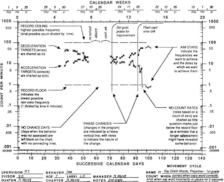
3. The Standard Celeration Chart (see Figure 1)
Lindsley (1990b) provides a brief history of the Standard Celeration Chart.
"...it was not until I was training teachers at the University of Kansas Children's Rehabilitation Unit that I was compelled to have a custom chart printed. The teachers met once a week for a 3-hour class. I required that they improve a behavior of one of their pupils and also one of their own behaviors. The teachers shared their progress on these behavior change projects by showing charts in class each week. It took 20 to 30 minutes to share one behavior project because most of this time was spent describing each teacher's unique charting and recording system." (p. 11)
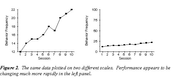
Lindsley recalls that "in desperation" he developed a standard chart. The y-axis was set up on a multiply scale to accommodate behavior frequencies ranging from 1 per day to 1,000 per minute; the x-axis was set up on an add scale to accommodate 140 successive calendar days, which is about the equivalent of one school semester. Thus, both frequent and infrequent behaviors could be plotted on the same graph and displayed for an entire semester. A goal of standardization was to save teachers time drawing and labeling the charts, and reading and interpreting the data. This latter point is especially important: "When teachers allow themselves the luxury of making a new chart for each behavior and learner, different pictures of progress are formed, the comparison of one program with another is difficult, and the evaluation of how well as program is working can be in error."
(White, 1986, p. 524). Figure 2 illustrates how the same data plotted on two different scales can suggest different impressions of a student's progress.
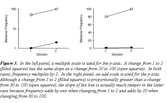
The multiply (logarithmic or ratio) scale of the y-axis on the Standard Celeration Chart offers other advantages. As West & Young (1982) note:
"When the scores from repeated measures of performance are plotted on the more typical 'equal interval' or 'arithmetic' scale, learning (represented by a line or function which 'best fits' the data) is found to accelerate. In other words, a curve with an ever steeper slope is created. When data are plotted on the standard celeration chart, learning is generally represented by a straight or nearly straight line. The value of the slope of the line which best fits the distribution of values on the logarithmic scale is thought of as an 'index of learning' The steeper the slope, the faster the learning is; the flatter the slope, the slower the learning is." (p. 132)
The word celeration is the root word of acceleration and deceleration, the two ways in which behavior can change on the chart. When frequency doubles from one point in time to the next, it is said to be accelerating at "times 2," abbreviated as x2. When frequency is cut in half from one point in time to the next, it is said to be decelerating at "divided by 2," abbreviated as /2. Celeration is standardized in the sense that equal ratios of performance change appear as equal slopes on the chart, independent of the starting frequency. For example, a change from 1 to 2 (x2) would look similar to a change from 50 to 100 (x2). On an add scale, a change from 1 to 2 (+1 but x2) would be dwarfed by a smaller proportional change from 80 to 100 (+20 but x1.25). This is illustrated in Figure 3. Lindsley (1990a) suggests we abandon the terms "increase" and "decrease" altogether when describing behavior change. He claims that a major discovery of Precision Teaching is that all behavior "multiplies" or "divides" and that we best think in these terms.
A straight line drawn from the lower left corner to the upper right corner of the Standard Celeration Chart has an angle of 33 degrees, which represents a x2 change. (Similarly, a straight line drawn from the upper left corner to the lower right corner represents a x2 change.) Lindsley's hope was that "If the central slope of the chart was a doubling, it would prompt our teachers to produce doublings of their pupil's frequencies each week" ( Lindsley, 1990b , p. 11). In this way, teachers might be more prone to discover major classroom variables that would affect student learning.
The major conventions for the Standard Celeration Charting are beyond the scope of this tutorial, although many of them are listed on Figure 1. For more information regarding the Standard Celeration Chart, see Precision Teaching Hub and Wiki, or The Chart Book: And Overview of Standard Celeration Chart Conventions and Practices.
4. The Learner Knows Best
Lindsley (1990b) tells a story of how he came to adopt this statement as a policy and slogan for Precision Teachers.
"When I was a graduate student, I trained a rat whose behavior did not extinguish exactly as the charts in Skinner's (1938) book had shown. My rat at first had responded much more rapidly when his responding was no longer reinforced. The rapid responding went on for about 30 minutes, at which time the rat stopped abruptly. I took the cumulative record of the rat's unusual extinction to Dr. Skinner and asked him how this had happened. How could the rat do this when the book showed a very different gradual extinction curve? Skinner answered, "In this case, the book is wrong! The rat knows best! That's why we still have him in the experiment! (p. 12)
A general rule of thumb in Precision Teaching is that if a student is progressing according to plan, then the program is appropriate for that student; otherwise, there is a flaw in the program and it needs to be changed in some way. In other words, the student's performance determines the "right" teaching strategy.
Students are active participants in Precision Teaching. Typically, students keep count of their movements on a daily basis and record the counts on a Standard Celeration Chart. This enables students to "see" their learning. The visual display reveals ongoing performance in relation to the goal, and is the basis on which the teacher and student decide what to do next. Lindsley (1990a p. 11) notes five advantages of students taking this active role:
- It costs less than teacher or observer recording.
- It produced records as reliable and much more valid than other recording.
- The effects produced were usually larger than teacher managed effects.
- It developed a trust of the learner in contrast to the erosion of trust produced by double checking of counts by teacher and observer.
- The learners developed higher order self-management skills to take with them in later life.
Standard Celeration Chart